
Presenting Data Series in horizontal columns
The Horizontal Bar Tile provides a horizontal chart expression for your data and includes smaller headings for the values and percentages linked to that information.


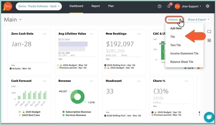
To create a bar tile, click the Actions button on the upper right of the Dashboard and choose Add New > Tile.
You can also clone any or repurpose an existing tile by clicking the ![]() Ellipsis on the existing tile and choosing Edit or Clone.
Ellipsis on the existing tile and choosing Edit or Clone.

After selecting Create New Tile or Edit for an existing tile, populate a Tile Name and pick Horizontal Bar Tile Type.
The next step is updating the Tile Data:
- Primary Source (here: 2025 Rolling Fcst) and Comparison Source (here: 2025 Budget)
- Selection Type as Data Series (for presenting a single Series)
Now you can choose what data will be pulled into the Tile. Click on the "ADD DATA SERIES" button and select the desired Data Element. Hit the SELECT button.
As shown in the example below, to get a Salary Run Rate Horizontal Bar Tile, we've selected the Data Element as "Salaries" for Total Department and Total Role:

Optionally, you can rename the added Data Series by hovering over the currently displayed Label and clicking on the Pencil icon (Edit Label):

The next Tile's customization item is related to the Tile's Time:
- The Date Range provides the user the ability to select varying lengths of time. It determines in what month(s) your capture will land in. For example, if you have an offset of -4, this means that you will look 4 months back. Say you have a starting date of September with an offset of -4, you would be looking (back) at data from May 1 forward. We want to present the Salary Run Rate for the Close Month.
- Show Actuals Until option determines e if all actuals that have been imported should be displayed or just actuals up until the Close Month. Choose Close Month to display actuals only up until the close month or Max to display all actuals available in your account.
Learn more about "Show Actuals Until"
Utilize Variances formatting as # and $ calculations to easily and quickly compare data between (Primary vs Comparison Source). Optionally, you can show Favorable Variance In Green and Unfavorable Variance In Red.
Data Labels and Legend: turn on or off the Legend.
Modify the Chart Color and choose the desired color palette and Negative Currency ($) in Red or the Default color.
At the end, you can customize the Currency ($) presentation by adjusting Decimals, Sign and Units.

At this point, you will see a Preview of what your Tile will look like and double-check the Data included within it.. Hit SAVE at the top of the Tile Builder screen once you are happy with the settings, and you will be brought back to the Dashboard.
 To move the Tile, simply click on it and drag the tile to the desired location.
To resize a Tile, simply click the bottom right corner of the tile and drag it outwards or inwards to resize. Other Tiles will automatically rearrange to fill in any gaps created by the resize.