The Column Tile (Vertical Bar) shows data in vertical columns. It can be used to show data that is from :
- Data Series
- Dimensions
- Overlay Line
Data Series - Single
Single-series tiles are good for displaying simple data or top-level data like total OpEx. Let's take an example of showing all OpEx for All Departments.
Step 1:Go to the Dashboard and select Actions and Tile:

Step 2:In the Tile Builder screen, give the Tile Name [1], select the Vertical Bar Tile Type [2], and choose the Primary Source as well as any Comparison Source [3].
For single-series, choose the Data Series as the Selection Type [4].
Now, click on the ADD DATA SERIES [5] button
and select the desired Data Element [6] (here Total OpEx for both Account and Department options) and hit the SELECT [7] button.

Optionally, you can rename the added Data Series by hovering over the current Label and clicking on the Pencil icon (Edit Label) [8].

Step 3:
Next, we are going to customize Tile's Time [9], Data Display [10], Data Labels and Legend [11] and Chart Color [12]:
- Time [9]
- The Date Range provides the User the ability to select varying lengths of time. It determines in what month(s) your capture will land. For example, if you have an offset of -4, this means that you will look 4 months back. Say you have a starting date of September with an offset of -4, you would be looking (back) at data from May 1 forward.
- Show Dates allows you to select Monthly, Quarterly, Yearly or Total
- Show Actuals Until option determines if all actuals that have been imported should be displayed or just actuals up until the Close Month. Choose Close Month to display actuals only up until the close month or Max to display all actuals available in your account.
Learn more about "Show Actuals Until"
- Data Display [10]: The Show Zeroes option can be enabled or disabled.
- Data Labels and Legend [11]: turn on or off Data Values, Data Series and Legend
- Modify the Chart Color [12] and choose the desired color palette.

At this point, you will see a Preview of what your Tile will look like and double-check included within Data:

Hit ADD at the top of the Tile Builder screen once you are happy with the settings, and you will be brought back to the Dashboard.
To move the Tile, simply click on it and drag the tile to the desired location.
To resize a Tile, simply click the bottom right corner of the tile and drag it outwards or inwards to resize. Other Tiles will automatically rearrange to fill in any gaps created by the resize.

Data Series - Multiple
Your Board or Management may request the consistent provision of a Dashboard containing multiple specific Metrics within a single Tile.
Multiple-series Tiles are great for displaying multiple different datasets maintained by Jirav, such as Current Assets & Current Liabilities.

Step 1:
Go to the Dashboard and select Actions and Tile:
Step 2:
In the Tile Builder screen, give the Tile Name [1], select the Vertical Bar Tile Type [2], and choose the Primary Source as well as any Comparison Source [3].
For single-series, choose the Data Series as the Selection Type [4].
Now, click on the ADD DATA SERIES [5] button
and select the desired 1st Data Element [6] (here 1st Data Element as Current Assets with Measure Type as Balance) and hit the SELECT [7] button.

Repeat the action for the 2nd Data Element [8] (2nd Data Element as Current Liabilities with Measure Type as Balance) and click on the SELECT [9] button.

Optionally, you can rename the added Data Series by hovering over the current Label and clicking on the Pencil icon (Edit Label) [10].

Step 3:
Next, we are going to customize Tile's Time [11], Data Display [12], Data Labels and Legend [13] and Chart Color [14]:
- Time [11]
- The Date Range provides the User the ability to select varying lengths of time. It determines in what month(s) your capture will land. For example, if you have an offset of -4, this means that you will look 4 months back. Say you have a starting date of September with an offset of -4, you would be looking (back) at data from May 1 forward.
- Show Dates allows you to select Monthly, Quarterly, Yearly or Total
- Show Actuals Until option determines if all actuals that have been imported should be displayed or just actuals up until the Close Month. Choose Close Month to display actuals only up until the close month or Max to display all actuals available in your account.
Learn more about "Show Actuals Until"
- Data Display [12]: The Show Zeroes option can be enabled or disabled.
- Data Labels and Legend [13]: turn on or off Data Values, Data Series and Legend
- Modify the Chart Color [14] and choose the desired color palette.

At this point, you will see a Preview of what your Tile will look like and double-check included within Data:

Step 4:
Hit ADD at the top of the Tile Builder screen once you are happy with the settings, and you will be brought back to the Dashboard.
To move the Tile, simply click on it and drag the tile to the desired location.
To resize a Tile, simply click the bottom right corner of the tile and drag it outwards or inwards to resize. Other Tiles will automatically rearrange to fill in any gaps created by the resize.

Dimensions
Dimensional Tiles are useful when you want to show second-level detail. This is the case where all the lines in the series belong to the same family and each time series is a child of a single-parent line, such as Opex by Account, Salaries by Department, etc.
Let's take the same example as we did for the Single Series Tile above, but this time let's show all the child lines: OpEx by Department.
Step 1:
Go to the Dashboard and select Actions and Tile:
Step 2:In the Tile Builder screen, give the Tile Name [1], select the Vertical Bar Tile Type [2], and choose the Primary Source as well as any Comparison Source [3].
Choose the Dimensions as the Selection Type [4].
Now, click on the ADD DATA SERIES [5] button
and select the desired Data Element [6] (as OpEx) with the right Data Selection [7] (here: Show OpEx By Department) and hit the SAVE [9] button.

Step 3:
Next, we are going to customize Tile's Time [9], Data Display [10], Data Labels and Legend [11] and Chart Color [12]:
- Time [9]
- The Date Range provides the User the ability to select varying lengths of time. It determines in what month(s) your capture will land. For example, if you have an offset of -4, this means that you will look 4 months back. Say you have a starting date of September with an offset of -4, you would be looking (back) at data from May 1 forward.
- Show Dates allows you to select Monthly, Quarterly, Yearly or Total
- Show Actuals Until option determines if all actuals that have been imported should be displayed or just actuals up until the Close Month. Choose Close Month to display actuals only up until the close month or Max to display all actuals available in your account.
Learn more about "Show Actuals Until"
- Data Display [10]: The Show Zeroes option can be enabled or disabled.
- Data Labels and Legend [11]: turn on or off Data Values, Data Series and Legend
- Modify the Chart Color [12] and choose the desired color palette.

At this point, you will see a Preview of what your Tile will look like and double-check included within Data:

Press ADD at the top of the Tile Builder screen once you are happy with the settings, and you will be brought back to the Dashboard.
To move the Tile, simply click on it and drag the tile to the desired location.
To resize a Tile, simply click the bottom right corner of the tile and drag it outwards or inwards to resize. Other Tiles will automatically rearrange to fill in any gaps created by the resize.

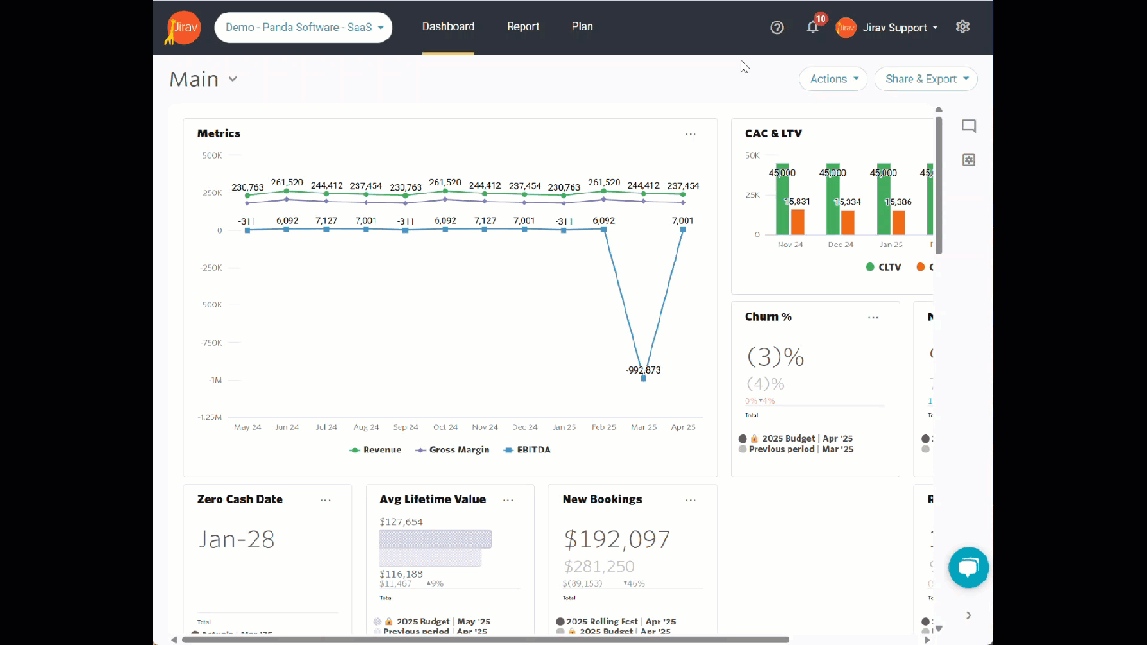
Overlay Line
The Overlay Line available within the Vertical Bar Chart enables displaying data points with the overlay line configured on a secondary y-axis. This feature is particularly helpful when the data ranges of the overlay line differ significantly from the primary data, allowing for a more accurate and visually balanced comparison. It ensures that both data sets are visible and interpretable without distortion, facilitating better insights and informed decision-making.
Step 1:
Go to the Dashboard and select Actions and Tile:
Step 2:
In the Tile Builder screen, give the Tile Name [1], select the Vertical Bar Tile Type [2], and choose the Primary Source as well as any Comparison Source [3].
For single-series, choose the Data Series as the Selection Type [4].
Now, click on the ADD DATA SERIES [5] button
and select the desired Data Element [6] (here LTV) and hit the SELECT [7] button.

Optionally, you can rename the added Data Series by hovering over the current Label and clicking on the Pencil icon (Edit Label) [8].

Click on the ADD DATA SERIES [9] button within the Overlay Line Section.

and select the desired Data Element [10] (here CAC) and hit the SELECT [11] button.

Step 3:
Next, we are going to customize Tile's Time [12], Data Display [13], Data Labels and Legend [14] and Chart Color [15]:
- Time [12]
- The Date Range provides the User the ability to select varying lengths of time. It determines in what month(s) your capture will land. For example, if you have an offset of -4, this means that you will look 4 months back. Say you have a starting date of September with an offset of -4, you would be looking (back) at data from May 1 forward.
- Show Dates allows you to select Monthly, Quarterly, Yearly, or Total
- Show Actuals Until option determines if all actuals that have been imported should be displayed or just actuals up until the Close Month. Choose Close Month to display actuals only up until the close month, or Max to display all actuals available in your account.
Learn more about "Show Actuals Until"
- Data Display [13]: The Show Zeroes option can be enabled or disabled.
- Data Labels and Legend [14]: turn on or off Data Values, Data Series and Legend. Once the Show Data Value option is turned on, Jirav allows you to:
- Show Overlapping Labels
- Customize the Label Orientation as Horizontal, Vertical, or Diagonal
- Keep Label Position as Inside or Outside
- Modify the Chart Color [15] and choose the desired color palette.

At this point, you will see a Preview of what your Tile will look like and double-check included within Data:

Step 4:
Hit ADD at the top of the Tile Builder screen once you are happy with the settings, and you will be brought back to the Dashboard.
To move the Tile, simply click on it and drag the tile to the desired location.
To resize a Tile, simply click the bottom right corner of the tile and drag it outwards or inwards to resize. Other Tiles will automatically rearrange to fill in any gaps created by the resize.